Monday, December 20, 2010

The Gregory Grandparents

The application of Universal Design has been something that I have been focusing all year through the development of separate living quarters that include a bathroom, kitchen, and child’s room. This project shows my knowledge of universal design in one small apartment for two elderly people.

One of the things that I would have done differently with my design was flip the residence so the entry to both interior homes where closer to the main entry to the whole home. This way the people would need to walk far to get to the home.

Another thing that flipping the residence would have fixed was that it would add a window to the bedroom. While it could have been easier to just add a window for this project the client did not want to add or remove any windows.

All together this project turned great, applying all the requirements for universal design in a small tight space built for two simple people.


Bathroom Design

The bathroom to me seems like the one place loaded with ADA requirements. No matter where one person looks there is a place that requires specific requirements. The toilet, shower, sink, pretty much every inch had to be attended to in order to fit the requirements.

For this bathroom I tried for a nature feel in order to tone down some of the over whelming ugly grab bars, ect.


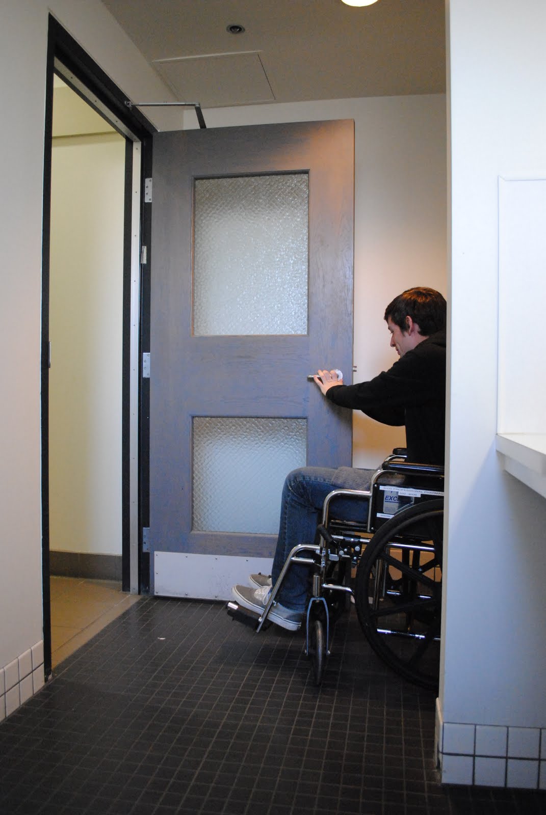
Wheelchair Experience

All semester learning about Universal Design and designing for a person in a wheel chair has been through books, articles and small lectures from my instructor. The only real way to learn about the size requirements and how to design for a person in a wheel chair can only happen after I had been in their shoes. So I took a wheel chair and explored on a building just to see what it was like getting around in a wheel chair.

One of the biggest problems that I noticed was in the bathrooms. While there was enough space to get into place, it was not an easy task to get there. I had to move back and forth a few times to move into place. Since I was have this much trouble in the bathroom it made me realize that when I design my bathroom I needed to apply more room then the minimum so the person can move straight to where they need to go without getting into tight places.

The other thing I noticed was the counter top to order food, at the small food stand was at about 5 ft. Way to tall for a person in a wheel chair. While the counter to receive the food was at a height that was accessible the ordering counter was way to tall to order food, making it not fit the universal design requirements.


Sunday, October 24, 2010

Child's Room

Before starting the designing for the child's room, which would eventually fit two 6 year old twin boys, I needed to get create another concept model. I created a separate concept model for the child's because a child's room had to be designed to be more kid friendly.

The best place to start looking for inspiration for a child's room is a child's book. The book I discovered was titles "What's Up?", which is basically about two children that want to find out what's up?. They start by going up stairs, then they climb a tree, climb a skyscraper, then end up on the moon and finish past the sun. At the end they come back down to ground and the reader realizes that it was all in their imagination. From that I wanted the focus of my concept to be focused around the imagination of a child.

I started with the idea of using circles to show the never ending imagination of the a child's mind. The fact that a circle is the only shape without corners or places were the line stops is what intrigued me the most about the shape. Since the children are still on earth I used the black boards to represent the real world or reality. The motion of circles through the black boards represents a child's imagination breaking though reality and showing that children have not limits and can do anything since they don't know any better. This is also seen through the entire book "What's Up?" as the kids do things impossible in reality, but when they use their imagination they can do anything.
A small part of the concept that I really enjoyed was fact that I used pastels to color the circles. A type of drawing media that can get quite messy made sense for this concept because children often get messy in everything they do. One of the final touches that I made to the concept was the fact that I took the pastels and smeared it all over my hands and wiped it on the black boards to give the visual affect of children finger prints. I thought this was the perfect way to wrap up the entire concept. Below is an image of the final concept for the child's room.


From the concept came the child's room. My main focus on the child's room in connection to the concept model was the circles. I used the wanted to use the idea of the different colored circles to create a an interesting lighting fixtures that would hang from the ceiling. All the fixtures were set colors that were made of transparent material that would let the light from the skylights above shine light through them and create colored lights below. The circle fixtures would also be have built in lights for night time when the sun is not shinning through the ceiling.
One of the parts to this project that I would like to improve and change was my delivery of my information. I feel that my room and designs were solid but the way that I presented them to my audience through my visual ads were poor. Looking back at my perspective sketches and two smaller sketches I feel they could have been stronger. Adding small details into drawings to show life, a human figure to give scale to the room, and a little more rendering would have really brought my drawings to life giving the clients a real idea of what I am trying to communicate to them