Wednesday, April 21, 2010

Interior Design Resume

This summer I hope to secure an internship with an interior design firm in the Portland/Vancouver area. I put together a little resume to show future employers my skills and experience. Since I am only a freshman in the interior design program, I do not have a whole lot of experience in the program. Everyone has started at this point in their career before, so I am not to worried about it being a negative aspect to my resume.
As a designer, I was able to make the layout of my resume more interesting than a ordinary resume, but stay professional all at the same time. I incorporated my logo into the layout of my design since my logo is a representation of myself. I took the human figure part of my logo, separated it from the rest, shrunk it down and used it as bullet points for each section. I feel that my resume is simple, but creative enough to catch the reader's eye and make it stand out against the rest. Below is my actual resume.
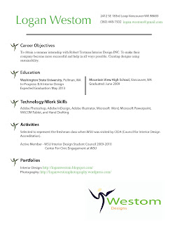
Click on image to enlarge


Saturday, April 10, 2010

Computer Sketch

This new sketch is something that I really enjoyed creating. It was not made in the traditional way, with pencil and paper, but with a computer and stylus. The product is called a WACOM Tablet. It is a large touch sensitive pad that transfers to the computer when you draw on the pad with the stylus. The pad is just as realistic as the traditional way, allowing the artist to have different line weights based on the pressure they use on the pad. The product is very useful if it is used in Photoshop because there are many different pen/pencil/brush tools that can be utilized to make the sketch one of a kind. The only down side is that it is a little tricky to use at first. Since the drawing and pad are two separate parts it is sort of hard to match up the stylus to the place that you want to start drawing again. This is only a problem for about the first five minutes, then it is really easy and fast to find that spot left off at. All together the WACOM Tablet is a great new inventions, that has opened a millions doors of possibilities that I might not have been able to create with traditional sketching. Below is the first sketch that I drew with the WACOM Tablet.

Image By: http://joeledbetter.com/

Wednesday, April 7, 2010

Logo Design

A logo is an important symbol that is used to represent a business, person, or group. I felt that it was high time to create one of my own to use on business cards, stationary, and other important documents.

Here is my first logo idea:

In the process of creating my logo I started by writing down some things that summarize my style and life. The words simple, unique, straightforward, green, environmentally friendly, easy to follow, and people friendly came up during brainstorming. The biggest words that I really wanted to emphasize in my logo design was environmentally friendly and people friendly. I knew that the simplest way of doing this was to use the color green and have a person in my logo.
The human figure part was created by complete accident. I was using the letter W and trying to make it into a human figure. I pulled down the middle of the W to get the legs and body, added a head, and then accidentally hit some button. That button warped the entire figure making it have a curved look. It was not the direction that I was thinking about, but it worked better than what I was planning on doing.
Adding my name was the easiest part. I found a simple font that would be easy to read and understand. The color had to be green to give it a look that says environmentally friendly. The color green is also bright and can catch a persons attention.
I have many ideas, for future logos, but for now I am very satisfied with my first design.