Monday, December 20, 2010

The Gregory Grandparents

The application of Universal Design has been something that I have been focusing all year through the development of separate living quarters that include a bathroom, kitchen, and child’s room. This project shows my knowledge of universal design in one small apartment for two elderly people.

One of the things that I would have done differently with my design was flip the residence so the entry to both interior homes where closer to the main entry to the whole home. This way the people would need to walk far to get to the home.

Another thing that flipping the residence would have fixed was that it would add a window to the bedroom. While it could have been easier to just add a window for this project the client did not want to add or remove any windows.

All together this project turned great, applying all the requirements for universal design in a small tight space built for two simple people.


Bathroom Design

The bathroom to me seems like the one place loaded with ADA requirements. No matter where one person looks there is a place that requires specific requirements. The toilet, shower, sink, pretty much every inch had to be attended to in order to fit the requirements.

For this bathroom I tried for a nature feel in order to tone down some of the over whelming ugly grab bars, ect.


Wheelchair Experience

All semester learning about Universal Design and designing for a person in a wheel chair has been through books, articles and small lectures from my instructor. The only real way to learn about the size requirements and how to design for a person in a wheel chair can only happen after I had been in their shoes. So I took a wheel chair and explored on a building just to see what it was like getting around in a wheel chair.

One of the biggest problems that I noticed was in the bathrooms. While there was enough space to get into place, it was not an easy task to get there. I had to move back and forth a few times to move into place. Since I was have this much trouble in the bathroom it made me realize that when I design my bathroom I needed to apply more room then the minimum so the person can move straight to where they need to go without getting into tight places.

The other thing I noticed was the counter top to order food, at the small food stand was at about 5 ft. Way to tall for a person in a wheel chair. While the counter to receive the food was at a height that was accessible the ordering counter was way to tall to order food, making it not fit the universal design requirements.


Sunday, October 24, 2010

Child's Room

Before starting the designing for the child's room, which would eventually fit two 6 year old twin boys, I needed to get create another concept model. I created a separate concept model for the child's because a child's room had to be designed to be more kid friendly.

The best place to start looking for inspiration for a child's room is a child's book. The book I discovered was titles "What's Up?", which is basically about two children that want to find out what's up?. They start by going up stairs, then they climb a tree, climb a skyscraper, then end up on the moon and finish past the sun. At the end they come back down to ground and the reader realizes that it was all in their imagination. From that I wanted the focus of my concept to be focused around the imagination of a child.

I started with the idea of using circles to show the never ending imagination of the a child's mind. The fact that a circle is the only shape without corners or places were the line stops is what intrigued me the most about the shape. Since the children are still on earth I used the black boards to represent the real world or reality. The motion of circles through the black boards represents a child's imagination breaking though reality and showing that children have not limits and can do anything since they don't know any better. This is also seen through the entire book "What's Up?" as the kids do things impossible in reality, but when they use their imagination they can do anything.
A small part of the concept that I really enjoyed was fact that I used pastels to color the circles. A type of drawing media that can get quite messy made sense for this concept because children often get messy in everything they do. One of the final touches that I made to the concept was the fact that I took the pastels and smeared it all over my hands and wiped it on the black boards to give the visual affect of children finger prints. I thought this was the perfect way to wrap up the entire concept. Below is an image of the final concept for the child's room.


From the concept came the child's room. My main focus on the child's room in connection to the concept model was the circles. I used the wanted to use the idea of the different colored circles to create a an interesting lighting fixtures that would hang from the ceiling. All the fixtures were set colors that were made of transparent material that would let the light from the skylights above shine light through them and create colored lights below. The circle fixtures would also be have built in lights for night time when the sun is not shinning through the ceiling.
One of the parts to this project that I would like to improve and change was my delivery of my information. I feel that my room and designs were solid but the way that I presented them to my audience through my visual ads were poor. Looking back at my perspective sketches and two smaller sketches I feel they could have been stronger. Adding small details into drawings to show life, a human figure to give scale to the room, and a little more rendering would have really brought my drawings to life giving the clients a real idea of what I am trying to communicate to them


Kitchen Design

The Gregory Kitchen was the first room that I have worked on, studied, and designed. It was something that is new to me that I have been looking forward to but sort of nervous about too. It was not as bad as I thought it would be. After all I had all my concepts created for the kitchen, inspirational song, and had just learned a great deal of information about different kitchen design.

The first thing that I considered was the overall shape of my kitchen. I had a large space for my kitchen so I knew that I could pretty much have have any shape. I ended up going with a L-shaped kitchen with an average size island. I went with the L-shaped instead of the U-shaped because I wanted to make sure that there was plenty of room for person in wheel chair to access the space and function with no mobility problems.

The next thing I worked on was figuring out the work triangles. Since the home will have two adults doing the majority of the cooking I wanted there to be space for two adults to cook. Having one primary work triangle and one smaller secondary work triangle.

The last major part I focused on was the placement, heights, and material options for all the appliances and finishes. This is the step that I feel I needs the most improvement. I was not to sure which materials to choose and when I did choose them I was not think to much about how they combine with the other materials that combine. Since completing the project I have gone back and thought about what I would do differently choosing as far as choosing materials go.

Below are the pieces of trace that I mounted on foam core showing my initial ideas for my the Gregory's kitchen.


Concept Development for the Gregory Home


When Interior Designers start searching for new and creative ideas they don't just come up with them on the spot, they take time to develop.
A concept is one of the places that they originate ideas from. This concept below is the concept model that I will be using on redesigning the Gregory house. From it I will create different rooms, spaces, and unique circulation for their home.

I used the song "Soul Meets Body" by the band Death Cab For Cutie as my main inspiration in creating the concept model.

I want to live where soul meets body
And let the sun wrap its arms around me
And bathe my skin in water cool and cleansing
And feel, feel what its like to be new

Above are the main lyrics that I used as inspiration because this part of the song pertained mostly to a home or place to live.

The main parts that I took from these few lines are "Soul Meets Body" and "Water cool and Cleansing"

"Soul Meets Body" - I took the idea of two different things coming together and meeting and applied it to a square cut in half that to form two triangles. This can be seen best in the overhead view on the image below. It shows two forms moving to and from each other, representing thing meeting and going away.

"Water Cool and Cleansing" - From this line I abstracted the lyric partly and came up with the idea of a wave washing over someone and cleaning/"cleansing" them. This can be seen in the perspective image below that shows the height of board ranges from five inches to 1 inch. This height difference represented waves
crashing and cleaning.

There were a few other parts I used as inspiration that helped lead up to my final design but those two lines are where a large amount of information was abstracted from. Below is the final product.

While this might be the final concept model for the Gregory home, there are still certain aspects that I would change. The main thing that I would like to change would be the overall structure of the model, I would make the model not so symmetrical. Since part of my inspiration is a wave it would make sense that the structure is not perfectly lined up and even. I could change this by moving each row up once set. This would create an uneven look, more realistic wave, create a structure that is not symmetrical, and more visually interesting concept model. Having created something like that would help to better communicate my concept and the direction I want to take with designing each room of the home in the future.

Monday, May 3, 2010

Process Poster

One of the jobs of a Interior Designer is being able to explain their ideas and process of a project to a client. This is an example of a process poster that I created for a model of a room that created. It shows every step of the process in creating the room. Starting with the artists that I choose to base my model around. Then I took something from nature and examined it from different perspectives. Took that and created my room model though a few 2D models and 3D models.

If I was to go back and improve this process poster I would work on integrating the four distinct quadrants that I have created. They do not flow or move together on the poster, which does not help to make transitions though out the entire poster. Although the intention maybe to have the viewer read the poster like a book , the bright and vivid colors may halt that from happening. Along with that I would also have more color mixing allowed in order to keep the persons eye from focusing on one part of the poster. That would create more contrast and be more visibly appealing. These steps would not take a lot of effort to change but the results would be really affective.

Wednesday, April 21, 2010

Interior Design Resume

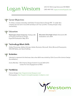
This summer I hope to secure an internship with an interior design firm in the Portland/Vancouver area. I put together a little resume to show future employers my skills and experience. Since I am only a freshman in the interior design program, I do not have a whole lot of experience in the program. Everyone has started at this point in their career before, so I am not to worried about it being a negative aspect to my resume.
As a designer, I was able to make the layout of my resume more interesting than a ordinary resume, but stay professional all at the same time. I incorporated my logo into the layout of my design since my logo is a representation of myself. I took the human figure part of my logo, separated it from the rest, shrunk it down and used it as bullet points for each section. I feel that my resume is simple, but creative enough to catch the reader's eye and make it stand out against the rest. Below is my actual resume.

Click on image to enlarge


Saturday, April 10, 2010

Computer Sketch

This new sketch is something that I really enjoyed creating. It was not made in the traditional way, with pencil and paper, but with a computer and stylus. The product is called a WACOM Tablet. It is a large touch sensitive pad that transfers to the computer when you draw on the pad with the stylus. The pad is just as realistic as the traditional way, allowing the artist to have different line weights based on the pressure they use on the pad. The product is very useful if it is used in Photoshop because there are many different pen/pencil/brush tools that can be utilized to make the sketch one of a kind. The only down side is that it is a little tricky to use at first. Since the drawing and pad are two separate parts it is sort of hard to match up the stylus to the place that you want to start drawing again. This is only a problem for about the first five minutes, then it is really easy and fast to find that spot left off at. All together the WACOM Tablet is a great new inventions, that has opened a millions doors of possibilities that I might not have been able to create with traditional sketching. Below is the first sketch that I drew with the WACOM Tablet.

Image By: http://joeledbetter.com/

Wednesday, April 7, 2010

Logo Design

A logo is an important symbol that is used to represent a business, person, or group. I felt that it was high time to create one of my own to use on business cards, stationary, and other important documents.

Here is my first logo idea:

In the process of creating my logo I started by writing down some things that summarize my style and life. The words simple, unique, straightforward, green, environmentally friendly, easy to follow, and people friendly came up during brainstorming. The biggest words that I really wanted to emphasize in my logo design was environmentally friendly and people friendly. I knew that the simplest way of doing this was to use the color green and have a person in my logo.
The human figure part was created by complete accident. I was using the letter W and trying to make it into a human figure. I pulled down the middle of the W to get the legs and body, added a head, and then accidentally hit some button. That button warped the entire figure making it have a curved look. It was not the direction that I was thinking about, but it worked better than what I was planning on doing.
Adding my name was the easiest part. I found a simple font that would be easy to read and understand. The color had to be green to give it a look that says environmentally friendly. The color green is also bright and can catch a persons attention.
I have many ideas, for future logos, but for now I am very satisfied with my first design.

Saturday, March 27, 2010

Positive and Negative Sketch

This positive and negative sketch is my favorite sketch that I have done. It is basically an inverted silhouette. I shaded the entire page and then erased the shading to create lines. Basically it is not a sketch but an erase. The sketch is an image of power lines at a very weird angle. While I was creating it, I also made it somewhat abstract. This is probably why some people cannot clearly identify the image. This sketch really allowed me to be creative and make something out of the ordinary.


Fruit Sketch

This is a sketch of the outside and a dissection of a kiwi. The dissection sketch turned out really well. Contrast and detail made the sketch look more real and life like. The outside sketch lacked both of these qualities. Looking only at the outside sketch, I do not think it is easy to determine what type of fruit it is unless you are informed ahead of time.


Key Sketch

This is one of my earlier sketches I did of my keys. Before I started this I set a time limit for the sketch so that I could improve my sketching speed. My slow sketching speed is something I really wanted to improve. I set only 10 minutes for this sketch. It seems sort of like a long time, but I am a perfectionist and tend to sketch really slow. If I had not set a time limit, I would have probably spent twice as long on the sketch. I feel that this sketch is one of my better sketches.


Thursday, March 25, 2010

Heritage Textile Pattern

This project was one of my favorites because I got to research my family heritage and create a design based on the culture. I really enjoyed creating my heritage textile pattern even though it took a while to figure out the design. My family's heritage is Irish so I went in that direction.

My final design came after throwing away five previous designs. Not being to thrilled with my quilt pattern, I really wanted to make sure my textile showed growth. So, if I was not satisfied with the design, I would alter it until I was satisfied. That meant starting from scratch five times. It was certainly worth the energy and time!
Single Pattern


Heritage Textile Pattern

(Click to Enlarge)

Concept Statement

Irish culture and heritage has been around for thousands of years. Ireland’s way of life is significantly influenced by the Celtic’s culture.

Ireland’s traditions are surrounded by Catholic ideas and figures. The iconic image of a shamrock was used by St. Patrick to help explain the Holy Trinity to pagans in Ireland.

The shamrock pattern repeated four times is the symbolic image of a four leaf clover and luck. The cross symbolizes the importance of the Catholic Church and patron saint St. Patrick. The Celtic symbol that splits the image through the middles represents Celtic’s influence on Ireland’s culture.

Wednesday, March 24, 2010

Quilt Pattern

In the process of creating my quilt pattern, I learned a lot about the different functions that Photoshop has to offer. I took normal pictures, nothing to special, and altered them in a way that no one could tell where the original image came from. Often times, I found myself not even being able to remember were they originated. After I experimented, altered, and messed around with different images and effects I, combined them all as one pattern. I cropped them, rotated them, rearranged them in a pattern, the end result was my finished quilt pattern.

Quilt Pattern


Individual Ideas


I feel that all the single images by themselves are interesting and I liked them quite a lot. However, when I put them together and made the quilt, I lost my fondness for the design. I think that when I was creating each individual image I was never thinking about making the individual images harmonize together, but I thought some of the images harmonized together but I thought it would look a whole lot better if I took out just one or two images and replace them with another image. That would change the look of things enough to make the images come together better in the quilt pattern. If I was to replace the rectangle shapes and just have the quilt pattern consist of triangles, it would fall nicely as one.

Making A Difference

As a designer it is always important to use my skills to help others and improve the world around me. Two design classmates and I got together last October to create something that would make a difference in the world.

Since it was near the end of October and near Halloween, we decided to create a device that could be used to distribute candy, one at a time. The device we created was efficient and able to preform
the function for which it was intended. The only thing that I would improve is the visual design of the box. Most people do not read sign and usually ignore them. Since many people fail to read signs, and usually ignore them, it would have been wise to convey the purpose of the device with photos or simple drawings. The words may not be necessary.

Here is the write up that the group did to explain our problem and solution.


Click On Image To Enlarge

Design Dictionary

As a designer I have to begin somewhere. I cannot jump into things knowing everything. Learning the basics is essential to everything that I do from now on. My Design Dictionary shows my understanding of the Elements and Principles of Design. It gives me something to refer back to as a quick refresher when my brain cannot recall something.

To create the Design Dictionary, I had to first study the Elements and Principles of Design. The next step was go out and photograph the things in the world that showcase these Elements and Principles of Design. This was my favorite part of the project because one of my favorite hobbies is photography.
The next step was to design the dictionary using the images I had gathered, the reason why each image fit each term, a definition of the term and a sentence using the term.

With all the trouble and technical difficulties of designing my dictionary, I was very pleased with the way that it turned out. My first idea was to use a gray background and white lettering. Those colors made sense to me because it would allow the images to stand out. I did not want to use any colors for the background or text because colors would alter the image's color to the viewer's eye. I soon found out that it is not possible to print in white ink, so I had to put that idea to the side until someone makes it possible to print in white ink. With that little set back, I decided to just make the design very basic, black lettering with a white background. Once I saw the finished project I realized the white background made more sense anyway. It really allowed the images to breathe and say a lot.

While the final product was printed and bound, I have created an image of all my Design Dictionary for everyone's viewing. Here it is. Click on image to view the full size. Enjoy!